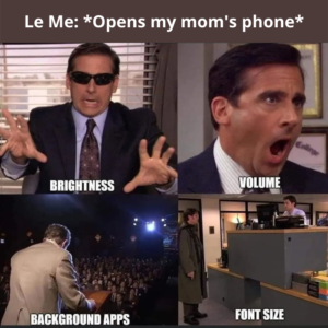
I’m sure many of us can relate to this meme with our own parents. I definitely did. Sometimes, I feel that Samsung could put the insanely irritating IPL air horn sound into its Galaxy lineup and my dad would still complain that it isn’t loud enough.
But jokes apart, this meme really got me thinking. Ringtones or other sounds that we might sometime find too loud for our ears, might be perfectly normal for our aging parents. And our laptop or phone backlight brightness that’s perfectly fine for us, might not be enough for them.
When I started seeing this problem from the lens of a product person, I realized that many of the tech products we use on a day-to-day basis are simply not designed to adapt to the natural aging process of humans and serve our needs as we grow older.
Why should you care?
I think companies that are turning a blind eye to the needs of the 60+ age group are letting slip a big chunk of their future profit. This includes product companies.
Over the years there has also been a cultural shift as we are seeing more financially independent seniors who do not live with their children. You can already see a lot of them using delivery apps, shopping apps, and other online services for their daily needs. This population of tech-savvy seniors has been steadily growing and you know it.
What’s the market potential?
India’s elderly population (aged 60+) is projected to touch 194 million in 2031 from 138 million in 2021, a whopping 41% increase over a decade, according to the National Statistical Office (NSO)’s Elderly in India 2021 report.
As you see, numbers don’t lie. It’s only logical that in addition to making products for the youth, the companies that sell in the Indian market today should also be investing more in R&D for developing products that are more accessible to the aging user base they hold for now and will hold in the future.
But the truth is – Despite the demand and requirement, there are only a handful of applications that make accessibility of aging uses a priority.
How do we design for senior citizens?
While I was researching the subject I found that accessible design is a well-known topic that all designers are familiar with. WCAG has laid down pretty straightforward guidelines that can be used for designing web apps for the physically challenged.
But surprisingly it was rather challenging to find specific frameworks or guides on how to design for something, that we will all experience sooner or later – old age! So, with the hope to inspire you, I’ve listed a few examples and guidelines that I think could help you design better products for older people.
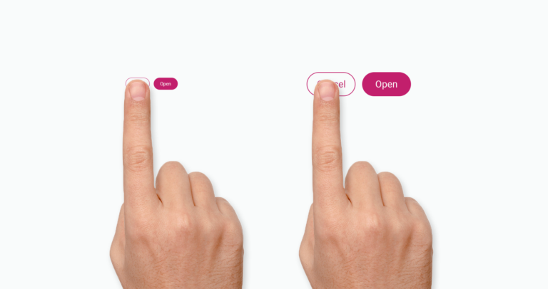
1. Use bigger buttons
2. Pick the right color shades

Did you know that as we age, shades of blues and purples become more difficult to distinguish? Colors are often used to communicate information such as errors, interactivity, etc.
Most of us will experience some type of age-related vision loss. By age 45, seven in 10 adults will need to wear glasses. Some also experience a decrease in color vision, which is the ability to distinguish between different colors.
3. Match Text to Color

When designing, supplement color coding with textual explanations so color blindness is not an issue. In addition, older users tend to prefer text, over symbols and colors, as a medium for information.
It also improves clarity and lightens the cognitive load. This benefits all users, not just older adults.
4. Choose the right text contrast
Text contrast describes the difference of the text color to the background color. It’s recommended to keep a contrast ratio of at least 4.5:1, although it would be best to stay over 7.0:1. If you are unsure, don’t worry, as there are plenty of contrast checkers online to confirm you hit those numbers. You can use the Material Design Guidelines and ready color palettes as a base and start designing from here.
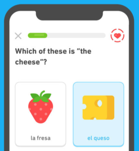
5. Avoid cluttered text background

How many times have you encountered, say, an image of a menu online that looked like this? People visit your product or website to get information, so it needs to be easy to navigate and understand.
6. Use optimal font size
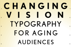
This one is the most obvious and if you didn’t know already – size matters. Make sure your body copy is at least 16px.
What would be even better is to consider adding the ability to adjust the font size and line height according to your user’s preference. You can see many devices and apps offer this feature now.
Before you leave, here's a fact that you must read
Pew Research estimates that 29 percent of ‘baby boomers’ aged 65 – 72 are still in the workforce. This number is only likely to increase as advances in science and medicine help us remain healthy and active longer. Today, one in six people in the U.S. are 65 years old or older; by 2030, that number is projected to be one in five.
If you are in the business of selling products or services, you must understand that these Baby Boomers currently occupy key decision-making roles in the companies to that you sell your product.
So, it would be prudent if we design our products keeping in mind that the older people are the ones who will be signing our cheques to buy our products. If you are still not convinced, you should at least do it for yourself.
When you are 60+, your body and perception would have shifted, and you’re likely to experience products and services differently. Most digital devices today are designed by and for younger people, and they aren’t optimized for your needs when you get older.
Hope this article helps people understand the need for a change in mindset to design products that are accessible to all age groups.