Thousands of product websites and apps are launching every day. To build a brand name, boost brand reputation, and generate more traffic, user experience design (UX-D or UE-D) plays a crucial role that directly contributes to revenue generation.
Here are five UX design trends that you need to keep a tab on in 2023 in order to stay ahead and give the best experience to your users.
1. Frictionless Sign-Ups and Sign-Ins
Every single application nowadays has a personalized account creation process that requires the users to create accounts with different credentials from app to app. It’s hard to keep track of so many different passwords even for those blessed with a good memory.
So, in order to create a frictionless signup flow, SaaS companies are adopting single sign-on (SSO) to provide users with more signup options. With an SSO, a user can log in to multiple apps with one login credential.
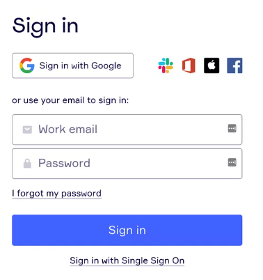
SaaS companies like Miro for example are adding more SSO options and removing forms to help users access the product faster. Notice how it’s not just about signing in with Google anymore?
The shift is now towards adding more SSO options that are relevant to your target audience. In this case, Slack or Apple.
Owing to the trouble of remembering multiple passwords, passwordless log-ins like the one MIRO employs, now have a great reception among users and it has become an important mobile app UX design trend to definitely look out for!
2. Dark UX Rises
Black is back! It was already in vogue in 2022 and it seems to be going nowhere (or everywhere) in 2023. Be it the UI/UX of the website design or mobile app design, ‘dark themes’ have become the new cool.
Scientifically ‘dark theme’ tends to minimize the exposure to blue light. This helps in reducing the strain on the eye caused due to increased screen time. Also, technically, the dark theme conserves power and extends battery life.
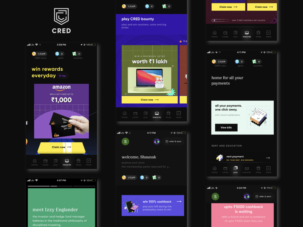
CRED is a big proponent of the dark theme and it is evident throughout their app. They made the decision to completely switch to dark mode as 9 of out of 10 CRED users prefer going black.
Other than that, choosing light mode with a toggle button for dark mode is also gaining in popularity as we head to 2023.
3. Immersive Experiences
Although virtual reality (VR) is a new frontier in UX design, it’s rapidly evolving.
Thanks to AR & VR, users are introduced to the world of virtual perception and are gaining a good grip on the tech. The UX design is now slowly tapping the potential of 3D visualization to incorporate them into websites and apps.
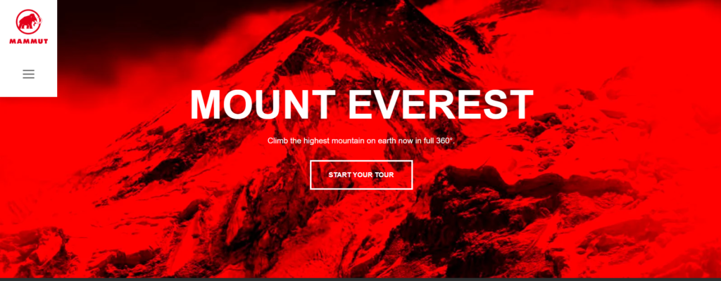
Mammut, a popular outdoor adventure gear maker uses interactive VR and 3D elements on their website to give their visitors a 360 degree tour of Mt. Everest!
This draws users in by creating depth and psychologically establishes Mammut’s expertise in outdoor adventure activities. A scrolling interaction takes users through an interactive and customizable climbing experience.
In 2023, it’s likely we’ll see more VR experiences combined with UX design.
4. Hyper-Personalization
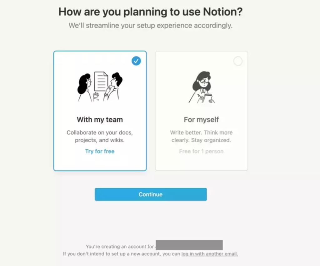
During the user onboarding flow, Notion separates users into two segments.
By identifying if a user is part of a team or solo, Notion can make the call about which unnecessary steps a user can skip and how they’d like to navigate the app.
Doing so will tailor each experience to what a specific user segment might need from the product.
It is human nature to feel special when someone remembers tiny details about them. And when the app’s UX is custom-made for individual users, user engagement is sure to increase. So, personalizing the UX design with a definite set of inputs is something that will touch the hearts of the users.
5. Designing for iPhone's Dynamic Island
Dynamic Island is a new pill-shaped cutout at the very top of the screen on the latest iPhone 14 which was launched in September 2022.
It surrounds the FaceID sensor and front camera, and users are able to view and interact with live activities within Dynamic Island if an app has been designed for it.
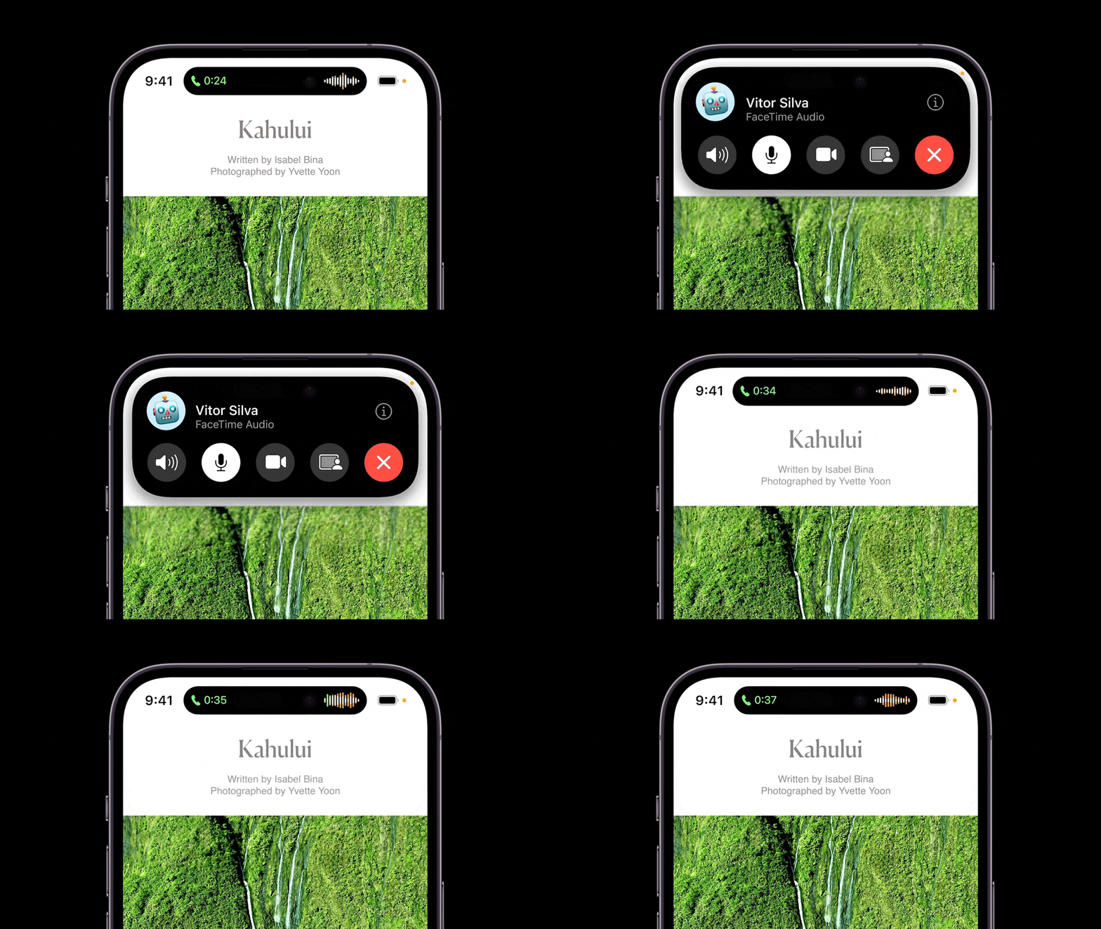
Facetime uses the dynamic island to alert iPhone users for incoming calls. The island transforms when you have an incoming phone call and shows a sound and timer indication while you have a phone call in the background.
You can tap and hold the Dynamic Island, and it expands to show more information, or simply tap to go back to the app.
There are many more interesting ways in which the dynamic island is being used by apps.
What are you waiting for?
This wraps up our guide on UX design trends that we think will be the most talked about in 2023.
Whether you’re working on a website or an app, these trends are worth keeping an eye on not just in 2023, but also over the next 3-4 years.
Now what are you waiting for? Open your notebook, Canva, Figma, Balsamiq, or whatever tools you use for designing and wireframing, and start your next UX adventure.


