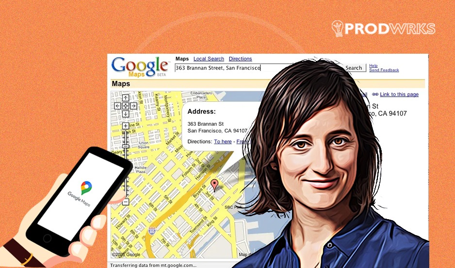

But Google had a secret four-step formula to rejig Google Maps, and the transformation from a clunky user interface to the present user-friendly version took just four months. So, how did Google Maps overcome this challenge?
Elizabeth Laraki, a former designer at Google Maps was one of the two people who worked on solving this problem. Recently, she shared the four-step process she used to redesign Google Maps into one of the most loved apps in the world today.

This case study holds important lessons for startups and product leaders who want to scale their products bogged down by excessive features accumulated over time and make it user-friendly to drive adoption.
Let’s explore the four-step process followed by Elizabeth Laraki to redesign Google Maps:
1. Deconstruct
The first step in redesigning Google Maps was to deconstruct the product. Elizabeth and her team listed all the content, features, and functionalities in the product and grouped them into categories. Here are some of the categories that Google Maps had in 2007:
- Map: The core element of the product that shows geographic information and allows users to interact with it.
- Navigation: The feature that helps users get directions from one place to another by car, public transport, bike, or walking.
- Search: The feature that allows users to find places, businesses, or addresses on the map.
- Layers: The feature shows additional information about the map, such as traffic, satellite, terrain, etc.
- Street View: The feature that shows panoramic images of streets and buildings.
- My Maps: The feature lets users create and share their custom maps.
Elizabeth Laraki explained in her tweet that her team wrote down all of the product’s current and upcoming content, features, and functionality and loosely grouped them into the following categories:
- Core features: The main tasks that users came to do with the product (such as searching, getting directions, or finding businesses)
- Aspirational use cases: The tasks they wanted users to start doing with the product (such as adding their own content, correcting inaccurate information, or using Maps to discover new places, etc.)
- Global actions: Actions that affected the whole page (such as printing, sharing, saving, etc.)
- Actions specific to use cases: Actions that were only relevant for a specific task (such as dragging a route or adding a destination while getting directions)
- Related features: Options that weren’t part of GMaps but were related to and existed elsewhere (such as transit information and business searches on Google search).
By deconstructing the product, the team could see the complexity and redundancy of Google Maps. They realized that some of the features were overlapping or competing with each other and that some of them were not aligned with the user’s needs or expectations.
For example, Street View was a cool and innovative feature, but it was not very useful for most users who wanted to get directions or find places. It also took up a lot of space on the screen and distracted from the map itself.
2. Reframe
The next step in redesigning Google Maps was to reframe the product. This means using user research, business goals, and intuition to make the product better, simpler, and scalable.
The team focused on understanding what brought people to the product, how they navigated through the development, what was working well, what flows were confusing, what options were missing, what information was valuable when, and what functionality was redundant.
They emerged with several key insights:
- Searching was the most critical task in Maps.
- Users searched for places such as addresses, businesses, parks, mountains, cities, etc.
- Users needed directions, but they seldom searched between two specific addresses. They usually knew their start or end point, like home or work. They also preferred to search for directions by typing the name of a place (Delhi Public Library, instead of looking up the address first).
- People could also add their own information to Google Maps and discover the world around them, which was essential for product discovery.
By reframing the product, Elizabeth’s team could define a clear vision and direction for Google Maps. They focused on three key aspects: simplicity, relevance, and personalization.
They wanted to create a Google Maps that was easy to use, showed the most relevant information for each user, and adapted to each user’s preferences and context. They also wanted to create a Google Maps that was scalable and flexible, that could accommodate new features and functionality without compromising the user experience.
3. Reconstruct
The third step in redesigning Google Maps was to reconstruct the product. This meant creating a new information architecture and user interface that supports the core use cases and the aspirational ones. The team used the insights and feedback from the previous steps to design a new Google Maps interface that was simpler, clearer, and more intuitive.
They followed some basic principles of usability to make key design decisions:
- The main features that users need should be easy to access
- The steps within each feature should be logical and clear
- The common actions, interactions, and views should be consistent
- The relevant actions should be available depending on the context
One of their challenges was to organize and find a way present the vast amount of information and features that Google Maps had. The team tried different ways of grouping tasks and linking related content.
For example, the image below represents one of their attempts to categorize different kinds of searches and show related information:
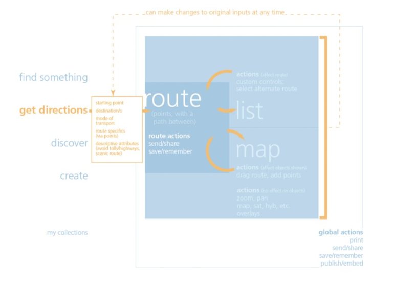
The team’s attempts to rebuild the site around user needs and flows resulted in several significant design changes:
- There would be only one search box for everything to simplify the interface and allow users to find what they wanted faster.
- Directions would be a secondary feature. Instead of being a primary tab, directions would be accessible from any place or location on the map. This would reduce clutter and make the map more interactive.
- Other features would appear in context. For example, transit would be a mode within directions instead of a separate tab. This would make it easier for users to compare different transportation options and plan their trips.

By reconstructing the product, the team created a new Google Maps experience that was more user-friendly and effective. They also reduced the product’s complexity and technical debt, making it easier to maintain and improve over time.
4. Scale for the future
The fourth and final step in redesigning Google Maps was to validate the new design with users and iterate based on feedback.
The Google Maps team knew that the product would keep changing, the information set would increase rapidly, and the feature set would grow further. This was in 2007.
But, they focused on key use cases and integrated information into the UI where it was relevant. They created a framework to support future growth. This framework allowed Google Maps to add new features and capabilities over the years.
Offline maps, where users could download and use maps without the internet.
Live View, which uses augmented reality to show users directions in the real world.
Incognito mode, which gives users more control over their privacy and personal data.
Wheelchair accessible routes in transit, which shows users the best routes to take using public transportation that are wheelchair friendly.
Sixteen years later, Google Maps continues to change. Yet, it is still simple and intuitive, and one billion people globally use it for their commute – all thanks to Elizabeth and her team, who planned for the future and built scalable design interfaces.
Google Maps’ rapid redesign and enduring success offer valuable insights for startups. By following a structured process, startups can enhance their products, maintain simplicity, and adapt to changing user needs. Embrace change, and your product could become a timeless favorite like Google Maps!