With an origin story that defies convention, Chirag and Sahil, former engineers from IIT Bombay, have successfully traded circuit boards and screwdrivers to pursue their ideology of minimalism.
From modest beginnings as a Facebook page churning out design inspirations, The Minimalist has grown into a 170+ member organization with an impressive roster of 200+ global brands, including heavyweights like Coca-Cola, Tata Cliq, Tata AIG, ICICI Prudential and Google.
When we dug deeper into their story, ProdWrks unearthed a treasure trove of insights on how The Minimalist is redefining user experiences with a unique philosophy of include > exclude > focus and a four-step UX design process.
Include, Exclude, Focus - The Art of Minimalism
Chirag and Sahil’s philosophy of minimalism revolves around three words – Include, Exclude and Focus. Chirag says, “When brands define their core value proposition, they have to sharply define that one thing they stand for. They can do it through our proprietary concept of include > exclude > focus.
Here’s a quick breakdown:
Include: This is a brainstorming phase, where The Minimalist identifies all potential elements associated with the brand or product without limitations.
Exclude: In this phase, they critically evaluate each element’s relevance and alignment with the core value proposition, to remove unnecessary or less impactful ones.
Focus: Once the extraneous elements are removed, they zero in on the most essential and impactful aspects aligned with the brand’s vision and user needs that will create an effective user experience and meaningful marketing strategy.
Sahil says, “Minimalism is not just in design. It’s everywhere. That’s how human minds also work. We have to figure out so much data before we can narrow down where to focus. So it’s embedded in our mind to include, exclude, focus.”
Deriving from the include > exclude > focus concept, Chirag says that their main reason for starting The Minimalist is “to do work which is very thought-provoking”, and the “best way to provoke thought and instill a reaction in people is to use the weapon of minimalism.”
“Simplicity is the ultimate sophistication. When you make the information very simple and boil it down to the very core essence of the idea, the people have to do the thinking, and then they’ll have that eureka moment themselves,” says Chirag
The Marriage of UX and Marketing
The two main business units of The Minimalist are marketing and design. Chirag and Sahil strongly believe that the ultimate motive of any creative process is to solve a business problem, be it in marketing or design.
The combined mandate and output of The Minimalist’s marketing and design business units are like a guardrail for the entire design transformation exercise for businesses they work with. They’ve done this for clients like Airtel, MoEngage, Udaan, and Razor Pay to ensure coherence across the entire product design and marketing journey.
“Once a brand has zeroed in on who they should be, what they should talk about, or where their campaigns are seen, the same journey should be reflected in the UI-UX across the whole ecosystem of digital products that the brand is building,” says Sahil.
“One fun fact is we have worked with over 18 Unicorns out of hundred which exist in India,” adds Chirag.
The Minimalist’s 4-Step Experience Design Process
The amalgamation of minimalistic principles in design and marketing is easier said than done. But the founders of The Minimalist have developed a four-step process that brands can follow to implement it.
The first step is to understand business objectives.
“Businesses usually have various objectives. They can be to improve product engagement, reduce drop offs, or improve brand recall. In the first step, it is important to understand the requirements or KPIs from the business and align them with various stakeholders,” explains Chirag.
The second step is to dive deeper into the life of the user.
Chirag stresses the importance of both the functional and emotional needs of the user. He says, “We try to uncover that through focus group discussions or one-on-one interviews with existing users, users who have converted as customers, and also with users who have not converted but have gone ahead with a competitor’s product.”
The Minimalist also utilizes user research through data analysis from platforms like Mixpanel and Google Analytics.
“We utilize these platforms to observe user behaviour. Often, what users mention versus what they do is completely different. So, we uncover a lot of insights through these platforms,”
The third step is designing the final output.
This is the most crucial part of the journey, says Chirag.
“Here, we try to match business goals with user needs. We do it by first building the user journey, then the information architecture, followed by building the wireframes, testing those wireframes, and then finally building the product.”
The fourth step is finding validation.
“Once the prototype and designs are ready, we go out to the market and validate them with real users. We test our hypothesis and keep iterating the product until it fulfils the end user’s wants and needs.”
Transforming Tata AIG's Digital Journey - The Minimalist’s Approach
One of the success stories of The Minimalist’s 4-step process was the redesign of Tata AIG’s digital insur-tech platform. The Minimalist team carried out research with existing users of Tata AIG and the key stakeholders of the company to discover these key insights.

The Business Objective of Tata AIG
1. Generate leads by generating quotes instantly and at scale for multiple users.
2. Redesign the UI to project a distinctive image for the Tata AIG brand.
Hopes and Disgusts of the User
1. Get quotes with minimal clicks or time spent.
2. Aversion to filling out cumbersome forms and uploading documents.
The Process and Solution
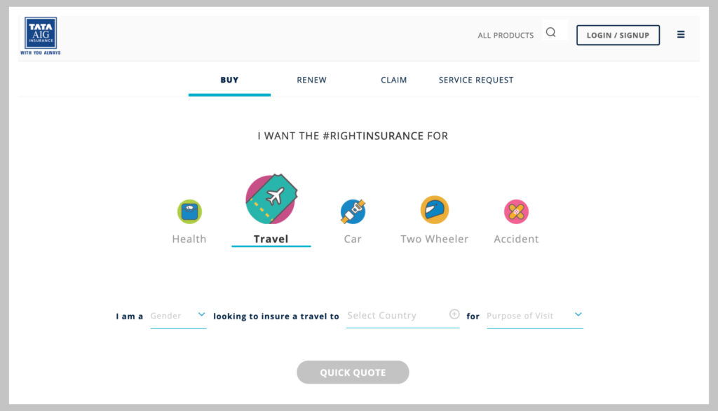
Typically, with general insurance players, their landing page is crowded with multiple tabs and offer banners. It was the same case with the previous Tata AIG platform. The user had to manually navigate multiple pages, input data, and click five times to get a single insurance quote. This led to people dropping off midway through the journey.
The Minimalist realized that the focal point should be the Get Quote button. They realized that people should get the quote in just two to three clicks. So the team applied the principles of minimalism (include > exclude > focus) to declutter the landing page. They also implemented third-party APIs like the Vahan integration to fetch user details so that users don’t have to input data themselves.

The outcome of the redesign, which happened in March 2020, was a great success because even after three years, the Tata AIG platform continues with the same UI-UX journey implemented by the Minimalist’s team. The revamped UI-UX journey reduced customer effort by nearly 90% and significantly cut down on user drop-offs.
“In UX, it is very important to see how you are making the life of people very easy. And, we got these insights from the interviews we conducted, and then we implemented that in our information architecture to ensure that the user journey had just two clicks to get an insurance quote,” says Sahil.
“Now, we see a lot of other insurance companies copying the same user journey, and it has become an industry-standard in the insurance space,” adds Chirag.
Understanding Users - The True Objective of Minimalism
The one thing that The Minimalist team emphasize is to listen to the users and see what they are saying.
“We often notice stakeholders thinking that they have been around for a very long time, so they know what the users want. But user interactions in their environment show a totally different picture, which we have noticed in case study after case study,” says Sahil.
“So, listening to the user and watching them in their habitat, interacting with the product and seeing what they are exactly doing can tremendously improve the trajectory of your product roadmap and development process, instead of just rushing through to the end stage. It is worth the time and effort in investment,” Chirag concludes.


